-Feedback From Portfolio And Blog
Feedback:

1.Navigation

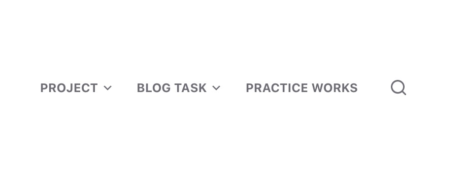
The previous navigation interface is very inconvenient, and you cannot directly view projects and blogs. So I redesigned this navigation interface, and now the audience can jump to the content they want to watch more conveniently.
2.Main interface

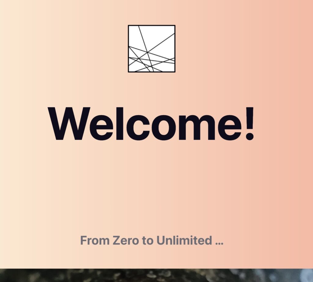
The previous main interface had only one photo that was not related to my project, which was a waste of space in the main interface. Some navigation bars should be added to facilitate the viewer to view the information. And I checked the blogs of many designers. I found that their personal webpages have many navigation bars. It is very convenient to find the information I want to see. I will continue to learn and draw on the advantages of their personal webpages, and continue to improve my personal webpages.
Generally speaking, my web page is a bit simple, and there are still many areas that need improvement, for example, adding more “people-oriented” designs to enhance the viewing of the entire web page. But at this stage, I am still a little unfamiliar with the operation of worldpress, and I need to keep trying its new features. I also often watch excellent blogs on the Internet, learn their advantages, and finally use them on my website to continuously improve the quality of the website.
